.png?width=246&height=70&name=Kinetech%20PM%20246%20x%2070%20(1).png)

96% of American adults own a cellphone, and 81% own a smartphone, according to PewResearch from 2019. This means your most in-need citizens who might not have a computer or transportation most likely do have a mobile phone capable of accessing an application.
Modernizing with Public Assistance Apps
As your department considers how to modernize, mobile friendly applications for public assistance programs are a great way to make it easier for people to apply and for your department to process and validate applications.
With easy-to-implement app solutions like the low-code options offered by Kinetech, adding a mobile application is relatively easy to do and does not require any major changes to your existing systems. But not all apps are created equal, and a poorly designed application will do more harm than good.
People Friendly Design
When designing your application, put yourself in the shoes of the citizens that will be using it to apply for assistance. Make it intuitive by keeping the process simple and straightforward by minimizing the “steps” an applicant must complete. Keeping the experience stress free for end-users will improve the completion rate, enhance your department’s customer service, and extend the programs reach within the community for at-risk citizens.
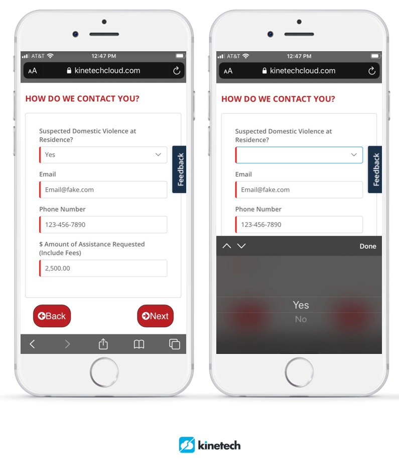
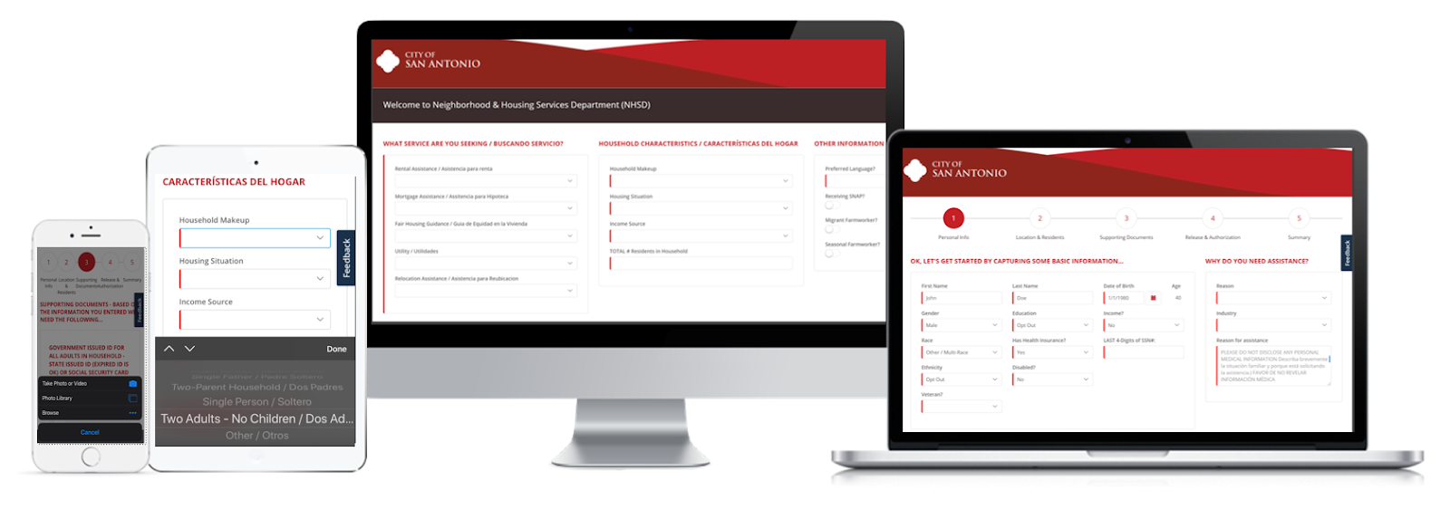
Example of a public assistance mobile application
The following tips are considered best-practice for any public assistance mobile solution:
- Only include the fields that are necessary to process an application successfully. For example, if you only need a first name, last name and SSN to verify identify, do not include extraneous fields like prefix (Mr./Mrs./Ms.), middle names, or suffix. These fields create extra steps for applicants while providing no value to the department; a time suck for all involved with no purpose. Before you start designing your mobile app, review your current digital or paper applications and determine which fields you need for this specific program only.
- Create the smallest list of required supporting documentation possible. If applicants can prove their identity and birth date with a social security card, do not also require a birth certificate. More documents equals more friction. The more supporting documents applicants must find and transmit to you, the less likely they are to successfully complete the application. This goes for mobile and non-mobile apps but is especially important when they don’t have someone helping them in-person.
On this front, your mobile app should clearly inform potential applicants of all the documents they will need to complete the full application before they begin filling anything out. This can be accomplished with a simple starter screen with a complete bullet list of required documents and “I have gathered all the above and am ready to apply” button that calls attention to the list or prevents them from starting before agreeing.
Some people grow concerned when we mention transmitting images of documents like social security cards through mobile applications. Any public assistance application needs to include full SSL encryption and data protection protocols to protect and encrypt (digital for disguise) private information that is transmitted through the app. We are happy to explain further, but when done correctly encryption is a very safe and widely used way of protecting any sensitive information someone might be sending you. - Design a logical journey for applicants. This might seem obvious but is one of the hardest things to do well. There are two ways people tend to go wrong here: they design the mobile app to simply go in the same order as the paper application OR they design the mobile app to progress in the order that they (the department) enters information into the current system. Both approaches fail to think about the user and what would make sense for them.
Our general advice for this is to follow this order:
-
- Start by clearly explain which application they are about to fill out, who typically qualifies for assistance (in a few bullets, not a multi-page explanation) and what documentation applicants will need to provide.
- Next, have users fill out the necessary identification fields – name, address, etc.
- Then ask them to upload/attach documents that prove the validity of what they just filled out.
- Continue in this pattern. If the next step is to submit your income, have them fill out the fields for this section, then immediately follow that with a request for the documents that prove what they just filled out.
- Most importantly, when they have filled out everything clearly do the following:
- Tell them they are about to submit the full application
- After submission, set expectations with a confirmation email explaining the following:
- How will benefits arrive?
- What other (if any) communications should they expect. If there are not further expected communications before the benefit arrives, tell them that as well.
- Set a realistic (or worse case) timeline expectation – “Processing applications normally takes 2-3 weeks.”
- Give them contact information or links to where they can see application status so they know where they can follow up with questions.
We also recommend using digital applications as an opportunity to setup an automated messaging system (email or SMS). These systems allow you to quickly push updates to applicants and can allow citizens to check application status or submit additional information if necessary. This is a great way to reduce incoming calls to your staff while also keeping the public informed.
An added benefit to this approach is the data is easy to report or create public facing visualizations. For departments using taxpayer funds or servicing the public, dashboards with approved statistics can easily be made publicly accessible and updated in real time. This increases transparency and trust with citizens in your community because its easy to see where funds are being distributed.
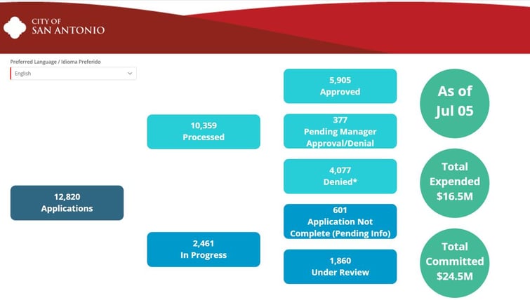
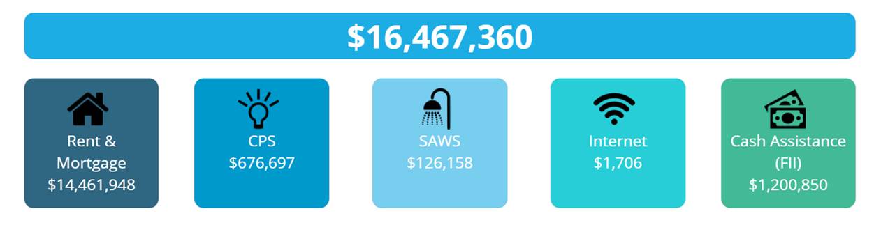
An example of a public data dashboard using low-code data to keep the public informed from the City of San Antonio
Follow Mobile Interface Design Best Practices
There are a lot of guides on this (like this one) but the main thing to keep in mind is to design the application around smartphone screen resolution first, not desktops.
A responsive-design, one that recognizes the screen resolution of the user and adjust accordingly is also a great idea. Applicants will likely be doing this on a smartphone so make sure the application is designed to work great on mobile phones. This means:
- Having appropriate font sizes that are easy to read on phones (large!)
- Not having hyperlinks buried in text, but using large, well-spaced buttons that a finger can easily select
- Placing buttons in easy to reach spots on phones (bottom left corner – thumb range!)
- Don’t use weird (fun, cool, etc.) fonts. Information should be clear and legible.
- Use high contrasts between any background colors and text, buttons, indicators. The easiest? Black text on a white background. Don’t get crazy with colors.
- Make sure the application loads up quickly on slow internet. You can use page speed insights to test this and get suggestions for improvements.
- Do not reinvent the navigation wheel – people need to be able to navigate your app without having to think too hard about it. Hamburger menus or other commonly used conventions are fine, although simply designing a swipe left (arrow indicating this) or a “Next” button to progress the application is the easiest way to make sure users do not get lost.
Applications need to work across a variety of screen sizes, but should be primarily designed for mobile phones
These are the main things to keep in mind. There are other minor details you can stress over, but the best way to know if your application is user friendly is to try it yourself. Once you have a working version, try applying from your own phone. Have everyone else in the department do it as well and collect feedback on issues and frustrations they run into. If you can, have people outside your office (family, friends, case workers) try it as well. Testing is the best way to find these issues and correct them before the app goes out to the public who are more likely to give up applying than to provide feedback.
When to Get Help
You will have the most knowledge of your applications, citizens, and programs, but you may not be an expert in managing cloud infrastructure, mobile (software) app design, modern security standards, and encryption. You may have an internal resource that knows some things in this arena in the IT or web departments, but there are also experts who design mobile applications specifically for government agencies, departments and offices that will help guide you through the process and without breaking your budget.
Kinetech offers specific Govtech solutions and recently worked with the City of San Antonio to roll out several public assistance applications. You can contact us at +1 (844) 546-3832 or info@kinetechcloud.com.